


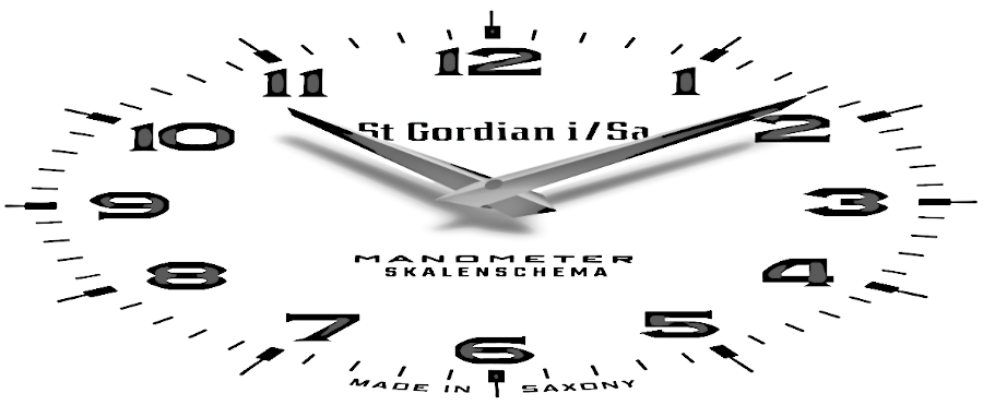
NUMERALS
Few details characterise a watch as much as its numerals. For this reason, I never use existing fonts, but design number sets exclusively for the pieces in my collection.
And there are even more good reasons for this. For example, some fonts look good in a straight line, but when arranged in a circle, they no longer harmonise. If the result is to be perfect – which is of course the case with my works – adjustments are necessary.
However, the licence terms often expressly exclude such changes. And, in any case, purchasing a licence is not worthwhile for me. After all, I only ever make a single watch from each design.
But perhaps the best reason to come up with my own typefaces is summed up in one simple question: Can you imagine anything more appealing
on your wrist than a unique timepiece with a quite individual touch?
Get an impression how my watches look like by visiting the Gallery.
Get an impression how my watches look like by visiting the Gallery.